Sandunguera Brewing Co.
OBJETIVE:
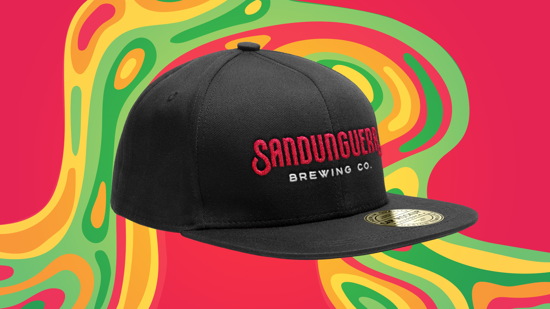
Redesign the current logo to obtain better implementations in different applications such as merchandise, packaging and social media. At the same time, we were looking to create a new visual style that differentiates itself from the competition with the main concept of "liquid creativity".
DELIVERY:
Logo, applications and visual style proposal.
COLLABORATOR:
problems with the original logo
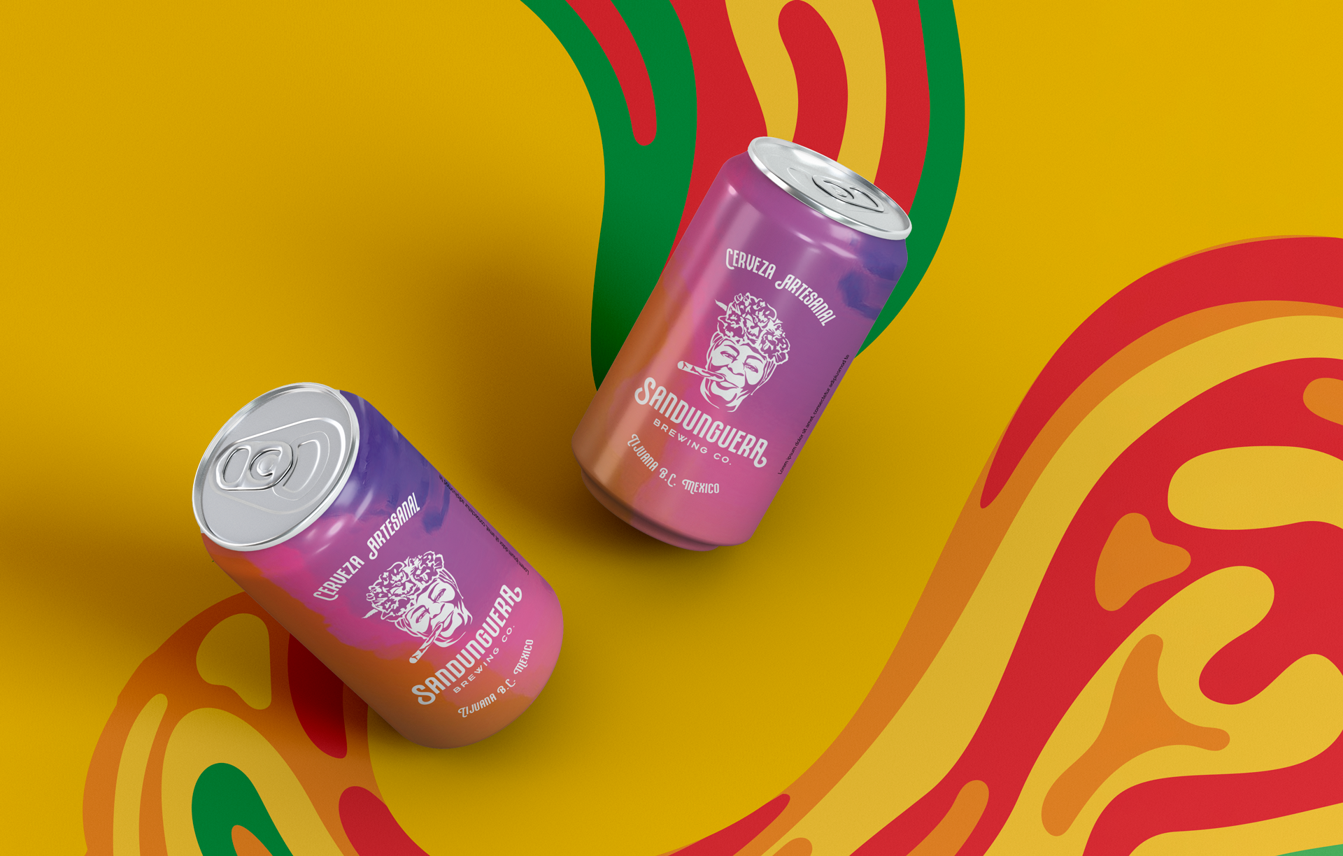
For our client it was of vital importance to maintain the logo that had been used since the beginning of the brewery, the image of a Cuban woman with a bean, this was the proper representation of "Sandunguera" which means: lively woman.
But at the same time we wanted the logo to be functional, since the image of the woman was completely lost on the packaging and labels of the beer, since there was not a negative version to use in different backgrounds and applications.
New Logo
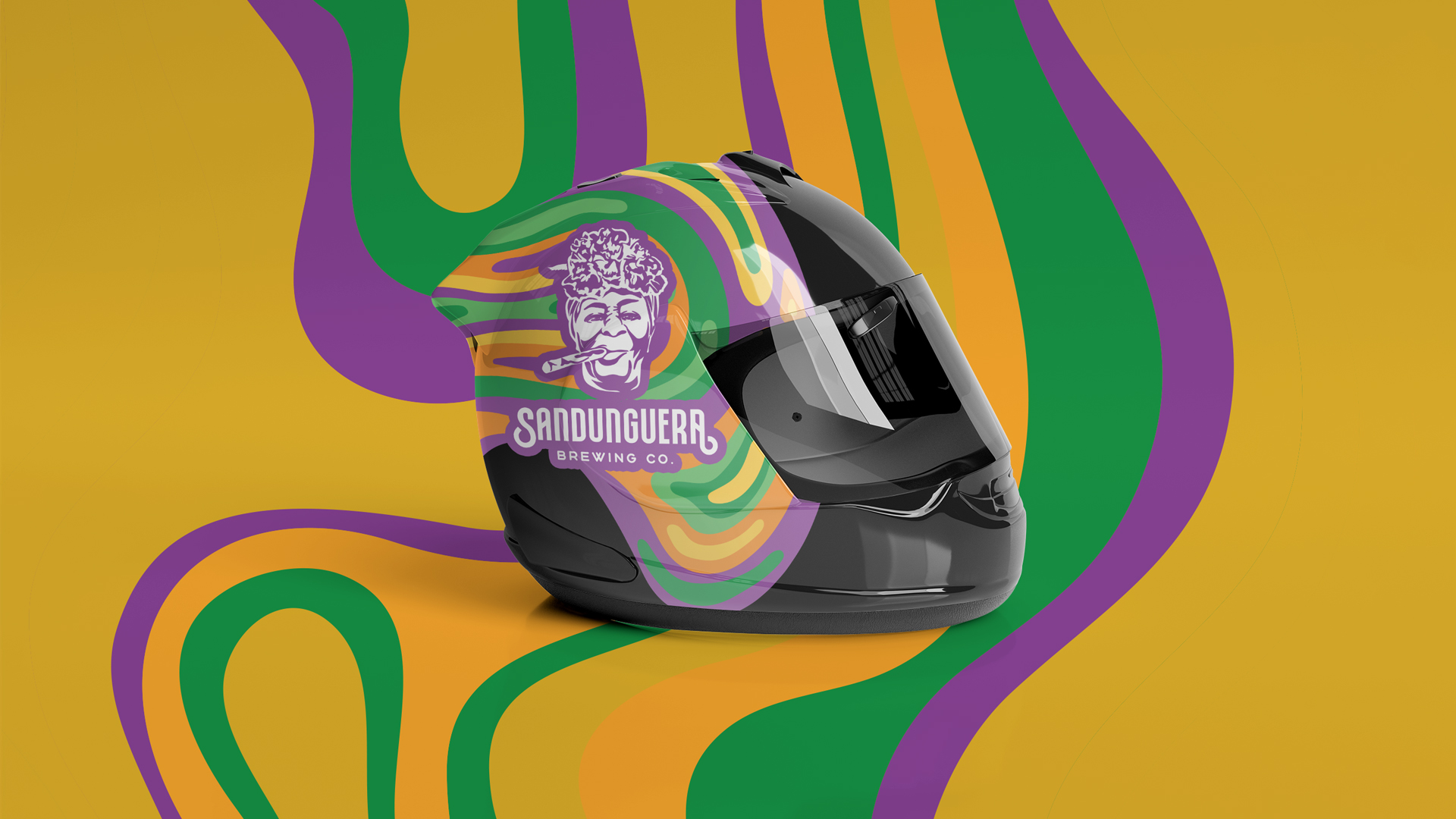
Finally we arrived at an illustrated version of the sandunguera woman that allowed us to expand the visual universe; highlighting the creativity, the experimentation for the product of quality craft beers, proposed with a magical and challenging touch, apprehending the passion for the high quality ingredients that it handles the Sandunguera Brewing Co.


Applications


Instragram Cover Highlights


